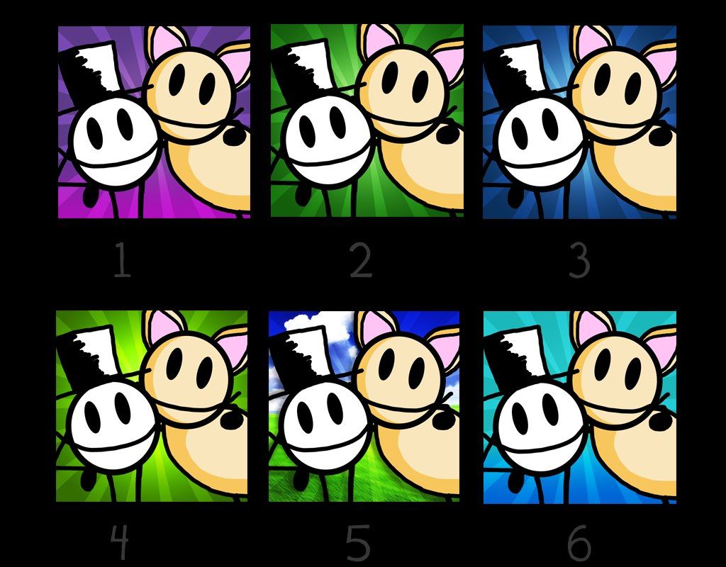
Need Opinion On App Icon
 gamesfua
Member Posts: 723
Hey all, I'm about 2-3 weeks away from beginning the app launching process. I've made a few potential app icons for my game. I'd love to get your opinion on which one you like better and or if you have any suggestions. I love feedback- so you can be as harsh as you want (just hopefully be constructive). I want the app icon to demonstrate an inviting, warm, friendly, cute, environment. I'd also like to keep the name of the app off of the icon. I kind of like it nice and clean. But I'm curious to your thoughts and why. Thanks so much!
P.S. I'd ignore number 5. I definitely don't want a busy background.

P.S. I'd ignore number 5. I definitely don't want a busy background.


Comments
Hi @anatomyofdreams Nicely done design! :-) My eyes were immediately drawn to no. 6, if that's any help to you.
Chakku
I liked the dark blue color more than the light blue.
Chakku