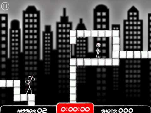
Bow Assassin (pre-release feedback please!)
 Crazybreadman
Member Posts: 674
Hey I've been away from the game making business for a while due to school, but after recently graduating I'm going full steam. I wanted to start out w/ a quick but high quality project. The video is gameplay of some early levels for Bow Assassin. I would love to hear back about what you guys like or think could be improved. I want to make it a really slick game, so constructive feedback is appreciated. Thanks!
*Also big props to TSB for the Tiny Balls template which I used for menus, scores, and stuff. Very helpful!
-Steve
www.crazybreadman.com

*Also big props to TSB for the Tiny Balls template which I used for menus, scores, and stuff. Very helpful!
-Steve
www.crazybreadman.com

Best Answers
-
Zoyt Posts: 374
Pretty sick. I like the things you added to the template. But to be safe, I would add a few more things and change some of the things the way tshirtbooth did it. For instance: the blinking level marker, the HUD that shows after a shot, the display after winning, etc. Oh: And I think the guys should move and move faster when they are aware of being attacked. And add particle for the arrow. But I really love it and plan to buy it :-)


Answers
Cheers,
C
@Zoyt- Thanks for the comments! I could change more I suppose. All the art has been redone, even the custom fonts, but some of the things you mentioned are still very similar looking in structure. Also I was thinking about having some enemies walk, but it won't work w/ the death animations because they have to be in a certain place to work (like smacking against the wall). I'll think on it though because I like the idea. And there's some particles trailing the arrow but do you mean ones that stay on screen until the next shot like for trajectory? BTW great feedback!
@Zoyt - it's hard to see the particles in the vid. But I'll rework them as you suggested. They could be better!
If anyone else wants to beta test let me know.
The app looks pretty cool.
I'll beta test. My TestFlight email is jckmcgraw@me.com
Regards,
Jack McGraw
Looks good. I love the way the arrow flies and gets stuck into walls.
Music fits the game. The sound effects are nice. Specially the moving walls/doors.
I'm not a fan of doodle art but your animations are awesome.
points of critique:
I don't like the blur in the background. The glow around the buildings don't seem right.
It would be nice if the bow and arm would show the strength of shooting instead of the circle.
I would play this. A nice twist on the Tiny Balls template. (I played TB a lot).
@jckmcgraw - ok you're added to the list!
@LudwigHeijden - Thanks, I'll take another look at the bg and rework it. I think the blur sets the background and foreground apart but maybe there's another way? I just don't want them blending and making hard to see the level elements. The bow animates as you pull back (the more power the further he pulls back). There's only like 4 steps in that animation so far though. How would you suggest doing that so it's clear how it measures w/ the previous shot? I think it may be difficult to see a previous indicator since the bow is small. Right now there's a red circle indicator and a red arrow that show the previous power and angle but it's hard to see in the vid.
Thanks everyone else that gave complements. They are very appreciated!
What I dislike about it is the glow around the buildings. It looks kinda dirty.
In which program have you created the illustration and added the blur?
About the bow. I didn't think about previous shots. Hm. I see your point.
Best of luck.
Darren.
The sky should fill the whole "background" of the document else you will get edges again but then on the inside of the buildings.
Your Welcome. Glad to be able to help
@LudwigHeijden - Cool, I reworked the bg how you described and it doesn't look bad. I'll probably do it your way.
@GLGames - The menu buttons are set up so that they are at 0 opacity or "holes" that are cut out of the black bg. Then behind that is a bg of the city which pans over. So you're just seeing through the button holes to the city image.
Pretty neat.
Great animations.... I'm trying to think how you can incorporate the arrow into the death rather than just have it stop in mid air and fade out. I understand your options are limited until GS adds some ragdoll physics but I just find it takes away that POW!!! in that killer blow.
Hey if you're going to do more animations depending on which part of the body you hit, it couldn't hurt trying out how it looks when you make the arrow disappear instantly and add it to your animation instead. Don't worry if the angle the arrow hits is a little off compared to the animation cause the reaction from the guy is so quick. You might be surprised!
Just my humble opinion.
I would take another look at the background graphics,, Im not sure about the blur.. I would suggest adding to the death animation,, how about blood red splat animation? This would hide the arrow fading away too.. it would make the kills more satisfying.. and red would be highlighted really nicely because of your color scheme..
Also, are you going to add more weapons? boomerang, knife,, machine gun,, grenade that could be cool.. good work!